
5 Website Mistakes and How to Fix Them
Quick! Load your website right now (in a separate tab because you need to finish reading this).
There has never been a more crucial time for your website to be right than right now.
It can be alarming to hear the news about the economy and inflation and, frankly, it can be exhausting. It’s coming at you from multiple directions and it makes you want to hunker down and wait for it to blow over rather than be proactive to get ahead of it.
It’s times like these that make (or break) great companies. Sales may take a little longer as people are slashing their budgets and business may look a little different but now is the time to make doing business with you easier for your customer. Your website is the front door of your business and it shouldn’t be difficult for your customer to give you money.
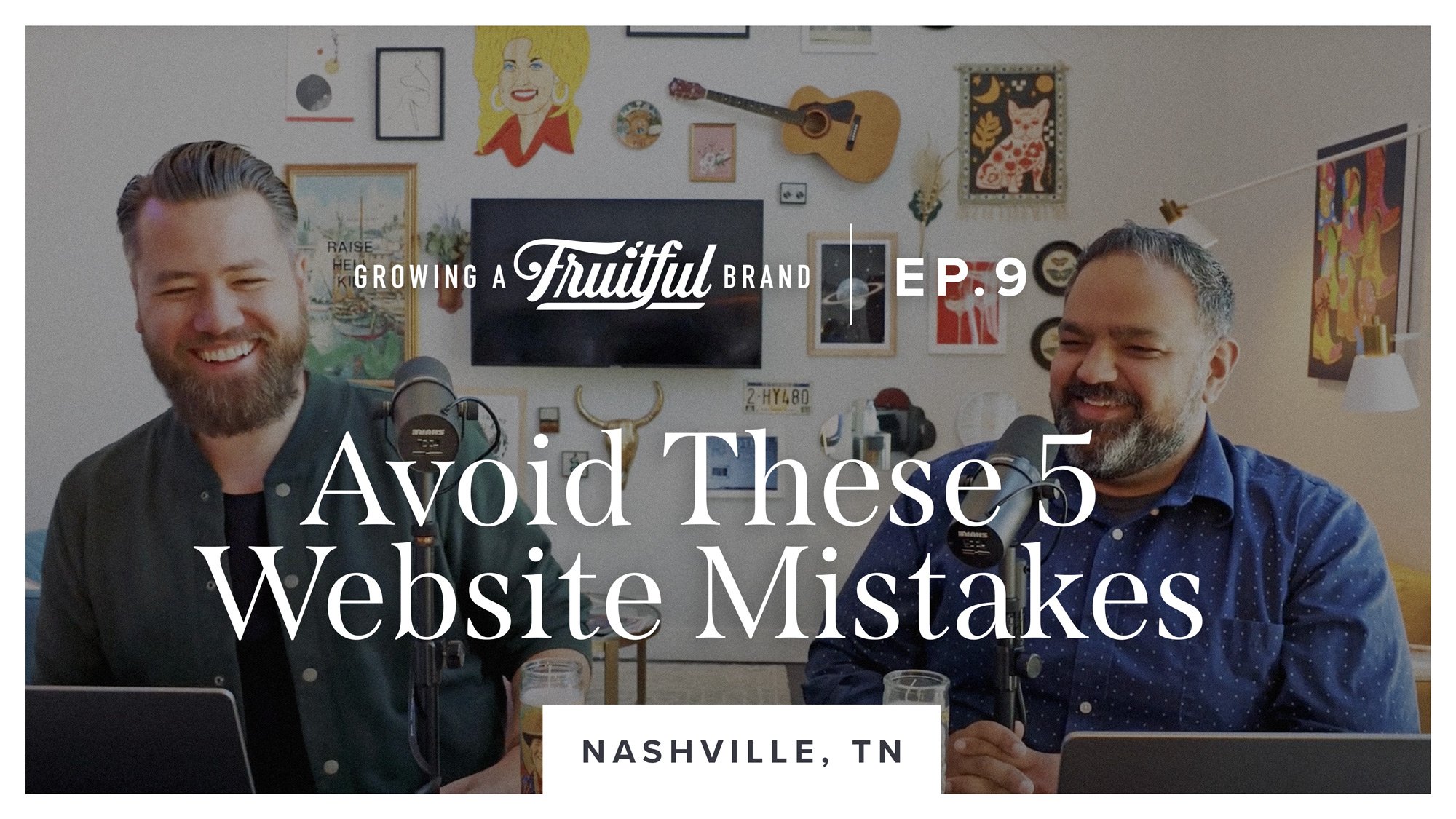
On this week’s episode, we’re joining you from the StoryBrand Guide Summit in Nashville and sharing the most common mistakes you’re (probably) making on your website and how to fix them. We invite you to pull up your website on multiple devices, and listen along as Ben and Raj give expert tips on web design and messaging mistakes you can easily fix.
Join us for an exciting and inspiring episode wherever you enjoy podcasts and be sure to subscribe so you don’t miss an episode!


Ep.9: Avoid these 5 website mistakes.
Automated Transcript
Raj Lulla:
Hi. I'm Ben Lueders and I'm a hot chicken.
Ben Lueders:
That's our clip.
Ben Lueders:
Hey, welcome to Growing a Fruitful Brand where we discuss how to create and grow a brand that makes the world a better place for you, your customers, and your employees. I'm Ben Lueders, Founder and Art Director of Fruitful Design and Strategy, and this is my business partner and brand strategist, Raj Lulla. If you're watching this, you might notice we're in a kind of different place. If you're listening, it might even sound a little bit different. We're coming to you from Nashville, Tennessee. We're here for a StoryBrand Guide Summit.
Raj Lulla:
As a StoryBrand certified agency, we are absolutely dedicated to helping your website be the best that it can, especially in the area of the story that you're telling, how you are entering your customers' story and making them the hero. It could not be any more important now more than ever to get your website right.
Ben Lueders:
Why now? What makes now a good time to work on your website?
Raj Lulla:
With all the unsteadiness that is in the economy, you want your website, which is your business's digital front door to be performing optimally, because if there comes a time when sales take a little bit longer or maybe even decreased, then you want the sales you are able to get right now to be as high as possible. You don't want to be missing opportunities. Then, when it comes to times that might be a little bit tougher or business might just take longer to close, then you don't want to be missing opportunities then especially. Right now is the time. Get your website right.
Today, we're going to go through the five most common mistakes that people make on their websites. Stuff that you can just get on your computer right now and go through, even as we're talking and see how your website performs according to those things.
Ben Lueders:
Let's just dive right into it. The first thing on our list today is responsiveness. What do we mean when we say responsiveness?
Raj Lulla:
Yes. It's how well your website listens when it's talking about your day.
Ben Lueders:
Sorry, my wife says I need to work on my responsiveness sometimes. Is that what we're talking about Raj?
Raj Lulla:
Yes. Yes. Absolutely. Responsiveness is a fancy word for whether or not your website performs well on both desktop and mobile applications as well as tablet, kind of all the sizes that your website could be. It used to be that websites had a mobile version and a desktop version.
Ben Lueders:
Right.
Raj Lulla:
It would literally send you to a smaller designed version of a webpage, but that's not how it's done anymore. It's done with code making. All of the elements shift around as the browser size [inaudible 00:02:51].
Ben Lueders:
Responding to the size and shape of your device. It's really brilliant, but when we were first getting into doing websites, it was crazy, one of the main things that would get us work is people had a site that was made before people were making websites responsive and they just simply needed a site. One of the main pain points was the fact that needed to be a site that worked really well, primarily on smartphones, but across all devices. Almost all platforms now are kind of built this way, website platforms, but still optimizing your site to work best when it's on mobile.
Raj Lulla:
Ben, that was almost 10 years ago that you started and a lot of people are like, "Oh my gosh, my website doesn't work on mobile." We've solved this problem now, right? All websites work really beautifully on desktop and mobile.
Ben Lueders:
Not necessarily. I mean, obviously, you'll see a lot of websites do work well and people do expect your website too. I think one important thing to mention is that the statistics show that more people are using their smartphones, or at least as many, are using their smartphones to access your website than a desktop computer these days. Yeah, you see a lot more sites that are technically responsive, but then you also see a lot of sites that, although, that you can pull them up on your site, it's really obvious that they weren't really thought through for a mobile interface.
We sometimes, in the website design community, talk about making something that is mobile first or mobile friendly, making sure that we're not just designing a desktop website or application and then at the 11th hour being like, "Oh crap, we need to make sure this thing works on a mobile device," but really thinking through all of the choices that we're making on a desktop version of the website. We're also thinking through how that would work on a mobile phone.
Raj Lulla:
I'm going to be a little less nice than Ben. There are still a lot of websites out there that really stink on mobile.
Ben Lueders:
Any you want to name or?
Raj Lulla:
One of the things I see the most is that on your desktop site, you'll have these big beautiful images that span the entire page and then when you switch it to a mobile browser, you look it up on your phone, one of two things will happen, either the image will be in a box or disappear in some weird way, or one of my favorites is when the designer forgot to code it so that the image shrinks down with it. You get a close-up on a guy's like nose hairs or something because it's just like, "Oh, nobody thought about seeing it just this part of the image.”
Ben Lueders:
Yeah.
Raj Lulla:
That's one thing. Buttons will move around and sometimes they'll cover other text or texts will cover the button or you might have buttons over top other buttons.
Ben Lueders:
Sure.
Raj Lulla:
You get all sorts of issues. If you think of, it'd be kind of taking your living room and making it a fifth of the size and then hoping all of your furniture fits.
Ben Lueders:
Oh yeah, yeah, exactly.
Raj Lulla:
Not putting it on top of each other. It's actually kind of a difficult pursuit and it's something that's easy to forget about because when, you work on a computer and so somebody designs the website and they send it to you, you look at it on your computer and you go, "Hey, looks great." Then, you pay your designer and you're happy with it. You don't even necessarily think to pull out your phone and look at how it looks on your phone, especially if your website was designed five, six, seven years ago.
It's been a minute since you've touched it and it doesn't work on mobile the way that you would hope. I want to remind you that the iPhone came out in 2007. It's been 15 years and now Google is punishing websites in search rankings if your website is not considered mobile friendly. That's about load speed, that's about how things rearrange and shift. It's about the size of the fonts on mobile, all of those things. If your website is not, it does not look good on mobile, then it probably is being punished by Google in search results for being mobile unfriendly.
My recommendation to you, again, this is stuff you can do today while you're listening to this podcast, pull up your company website on your phone and see how it looks. I consider this to be the unforgivable sin of website design in 2022, 2023. It's been 15 years since Steve Jobs unveiled the iPhone. It is time to make sure your website [inaudible 00:07:44].
Ben Lueders:
Yeah, you can't use that as an excuse anymore.
Raj Lulla:
Yeah, we have a B2B company, because you might wonder, it's like, "Well, most of my clients work in offices, all that kind of stuff." We have a B2B company that is kind of the exception to the rule being that on most websites, about 60% of traffic comes from mobile. The B2B company of ours, the exception to the rule, 60% of their traffic comes from desktop. That's still 40% of a B2B company that their traffic comes from mobile.
People are looking at their website thinking about buying maybe while they're on their lunch break, maybe while they're home, put the kids down for bed and they're watching a TV show, a bowl of ice cream or glass of wine and looking at their website on a mobile device.
Again, this is the unforgivable sin of website design. It is not an option not to be good on mobile anymore. It's just absolutely not. If you pull up your phone and if you have an iPad or a tablet, get that out too because a lot of times the menus get all funky, the buttons are on top of each other, all those things that we talked about, check it today. It won't cost you a dime. It'll cost you a couple minutes. Put all three of your devices in front of you and see if your user is getting a second class experience for being on a mobile device or a tablet.
If they are, then get some help quickly. Call us. Call your web designer, whoever you're working with that it's the unforgivable sin of web design. Get it fixed quickly because Google's punishing you for it, and you're losing sales and attention to people who are just tired of having website that doesn't work for them.
Ben Lueders:
I'm glad you mentioned, iPad and tablet too. I think sometimes that's like the forgotten form, but that's really important too because when you have a responsive website, it's really important kind of where the breaks are and stuff like that. Sometimes you might get something that it works good on an iPhone or an Android phone and it works good on desktop, but then you look at an iPad and it's like, "Oh, that's pretty wonky.”
Raj Lulla:
This is one of the questions we used to get a lot. I've gotten a little bit less recently, but the difference between Wix and Weebly and Squarespace and some of those, any of those out of the box programs that you could try to make a website yourself. I always found that Wix and Weebly performed significantly less well in responsiveness, especially maybe you could get it right on phone, maybe you get it right on desktop, but that switch that's kind of in the middle with tablet, I always found that to be a little wonky. Like I said, the menus would go a little funny and it would be harder to use.
Ben Lueders:
Yeah.
Raj Lulla:
I haven't used either platform for a while and so I don't want, don't call me if you're their lawyers, although, honestly I'm flattered if you're listening and you work for Wix or Weebly, but in our experience, Squarespace performed considerably better with responsiveness across devices and it even has a little button at the top where you can view what device, what it's going to look like on what device. When we design for clients in Squarespace, that's one of the reasons why is because we can make sure that it's optimized across all platforms.
Ben Lueders:
We're going to have to definitely do a future episode about comparing different website platforms and I think that'll be a lot of fun and a good service to our listeners. All right. Moving on, let's get into messaging. I think this is the one that we're obviously very passionate about being StoryBrand certified agency, but why is getting your messaging so crucial, getting it right, why is that so crucial to having a good website?
Raj Lulla:
After your website is just technically correct, that it's responsive on mobile, you're not being punished in the search results, you've got about 30 seconds for somebody to decide if they're going to stay on your website. There's actually a 3-second rule and a 30-second rule. Three seconds is how fast it loads, 30 seconds is how long, if they're going to stay for more than 30 seconds. In that time, you've got to help them understand that they're in the right place.
Again, this goes to putting them as the hero of the story, appealing to their aspiration and showing that you can solve the problem they have all in under 30 seconds. If your website has a lot of text on it, it probably is not doing that quickly, because if they have to sit down and put on their reading glasses and decide, "Is this the website for me," they're gone. They're already gone. By the time they have to even think about finding their reading glasses, they're gone.
Yeah, you got 30 seconds to connect to their aspiration. Make sure that they're identified as the hero of the story, that you understand their problem and that you offer a solution to it. You can guide them to success. That's a heavy lift to do in such a short amount of time. That's why StoryBrand is what it is. We give this really simple framework using seven elements of story to help you do that in as few words as possible and images too.
The images on your website have to show the story that you're telling. A lot of times people will, they're like, "Oh, we help schools." I actually just did this. I was reviewing a school website recently and they showed a beautiful, well-lit photo of their school at night and there were no children around.
Ben Lueders:
For night class.
Raj Lulla:
Don't get me wrong. The landscaping looked beautiful and the lights in the landscaping had that starburst pattern. It was beautiful. No children there whatsoever. It doesn't communicate the story that school helps children be successful and it's a private school. They're asking parents to pay money to send their children to school and the imagery doesn't tell that story at all.
Ben Lueders:
That is such a common mistake, I think, having images that maybe really connect with the owner of the company, their employees, but don't really tell the story of the people who might be visiting the business or establishment. I was similarly was just working on a website for a coffee company where it was a site that we had done a while back and then I was checking in to see how I was looking and they had changed some of the images and it was literally their headline had to do with people and people enjoying coffee and the picture was inside of their beautiful space, completely empty [inaudible 00:14:34] people and of coffee.
It was like, look at this amazing beautiful shot of interior design and decor, just great vibe, great lighting and none of the things that we're about. It is just funny how you can be so close to the right thing, but just thinking of it from kind of the wrong perspective. As someone visiting that establishment, they want to see this as a place that they can imagine themselves, they can see themselves there, and meet others there, enjoying a great beverage, instead of as the owner who's like, "What a cool, nicely designed space I have.”
Raj Lulla:
I paid a lot for this building.
Ben Lueders:
Yeah, exactly. Look at this furniture.
Raj Lulla:
I'm going to show you a picture of it.
Ben Lueders:
Yeah, exactly. It is that kind of subtle thing. That the mistake that we see is just basically whether in the messaging and in the imagery and the design, basically trying to tell our story as the owner or the business owner instead of really trying to connect to the story and the aspirations of the people visiting the establishment or the business.
Raj Lulla:
Yeah. If you haven't listened to our whole episode on what is StoryBrand, I recommend going up a few episodes in the feed and listening to that where we go much more in depth of how to put your customer as the hero of the story and position yourself as a guide to their success.
Ben Lueders:
Yeah. All right, next step, we've got CTA. What does that stand for, Raj?
Raj Lulla:
I think it's one of those scans that you get at the hospital, right?
Ben Lueders:
Exactly.
Raj Lulla:
Yeah. CTA, there's a lot of acronyms in marketing and business, CTA, call-to-action. You have to call your customers to action on your website and do not, do not waste that opportunity. Here are a few of the common mistakes that we see in calls to action. One is that we call them to an action that is educational and not action oriented. If you have learned more on your website as your main call to action, it's a mistake.
One of the other big ones that we see is that there is no call to action. You just kind go through the navigation and it's about and our products and services and pricing even, and then just the normal looking link that says contact. No call-to-action whatsoever. There's this weird insecurity that people have about their product and their service on their website that they go, "Well, we don't want to be pushy about sales.”
Ben Lueders:
Right.
Raj Lulla:
Buy now button that's too aggressive and maybe that is for your business, but that doesn't mean that schedule a call or get a free consultation are bad things that your customer wants to know if you are really solving a problem for them, how they get that solution and you're actually robbing them of an opportunity to connect with you, if you make it confusing. You're going to lose if you make it confusing. It's in the StoryBrand book, if you confuse, you lose. Those are a couple of the most common mistakes that we see in call-to-action on websites. What's some of the other?
Ben Lueders:
Well, the one that comes to my mind is that it's call-to-action, not call to actions, plural. I think, I see this all the time, a couple things. I see many different calls to actions throughout the site, different things. I've got lots of different things I want people to do and they need different places. Basically, trying to do way too much with your website.
Raj Lulla:
Yeah.
Ben Lueders:
We believe that a website really should be about one big thing. There's little places where they can learn more, let's say on about page, et cetera, but really there should be one main action that you're trying to get people to take, and so having just lots of different ones. The other one is it's the same call-to-action but worded differently on different buttons. You might say contact and then maybe contact us and then reach out somewhere else.
Raj Lulla:
Get a free estimate.
Ben Lueders:
Get a free estimate or even from a design perspective, it's a green button up here, it's a red button here, it's a blue button here. If you confuse, you lose. It can kind of just overwhelm people. They don't know which one, do they all do the same thing? You start experiencing some of that people bouncing from your site because they don't know what you want them to do. It really needs to be super, super simple in order for you to get that the kind of action out of people that you want.
Raj Lulla:
Websites are technologically complex, but they're psychologically simple. Call people to one action and do it multiple times down your homepage and especially on your homepage. You should have a call to action on every page, even on your about page. When you talk to your client about why you're doing what you're doing or I would even recommend on about page making it about them, making it about, "Hey, you know how you experience this problem, this is why we're in business is to solve this problem," and then call them to action.
It should be multiple times down your homepage. It should be on every page. Again, this is something that's easy that you can do. Go look right now on your website. If you don't have a call-to-action button on every page, put one there and if you don't know how to do it, call and ask for help. You should have a call to action button on every page and multiple times on your home page.
The reason why is because, again, there's this weird insecurity people have about, "Well, I don't want to be pushy. I don't want to ask too much," until they'll put one green button, one red button in the top right hand corner of their website, which is the right place, so good job doing that, but it's sort of going up to the girl you've got to crush on in high school and asking her to the dance and then immediately running away.
It's like before she even knows your name or when the dance is or any of that. It's just like, "Will you go to the dance with me?" Then, you run away and you don't ever ask again or stand there, wait for an answer. You have to have it multiple times down your page. You got to have it on every page on your website.
Ben Lueders:
I will say as a designer, I really did kind of balk at this at first, especially having that same call-to-action multiple times on that homepage down, that's one of the things when you get into the StoryBrand framework, they're really big on that right after this part you have the call-to-action, right after this part you have a call-to-action, and myself and some of our other designers were kind of at first, do we really need to have it this much? It just seems so needy and it seems so, but it's just amazing how well it works. You can't really argue with the psychology of it and it's for the user, it actually, if you're really connecting with them and their problem, you're doing them a service making it as easy as possible for them to get in touch with you.
Raj Lulla:
How many light switches do you have in your house?
Ben Lueders:
One. We have one.
Raj Lulla:
Yeah, we're in an Airbnb right now, again, in Nashville and you don't really think about things like light switches until they're not where you want them to be. There's this huge staircase over here in the Airbnb and the one to turn off the lights that are down here is only at the bottom. If you make it up to the top of the huge staircase and you forgot to turn off that light before bed, guess what you're doing? Down and up again. You're getting your step counted today.
It's the same for contact buttons or for call-to-action buttons. You want them everywhere. Somebody might need them and you after a while, you just don't notice them. You don't notice how many light switches are in your house and you don't notice how many outlets are in your house, but you definitely notice when you're trying to plug in the vacuum and there's no outlet exactly where you need it because the kids spilled something.
Ben Lueders:
I like this light switch metaphor, though, because have you ever been in a house and maybe this is your house, I can't remember, but where you have more light switches that do the same thing, but they're in weird spots. They're not where they should be. You know what I mean? It's not convenient. It's like, "Oh, that switch turns off the thing in the other room? Who would've ever, who wired this place?" It's like, yeah, it's there, but it's not in the place that would be most convenient for taking action.
Raj Lulla:
You know what's even worse? My house has mystery light switches.
Ben Lueders:
You don't know what they're doing?
Raj Lulla:
In our dining room, there's a three switch panel and one of them turns on the chandelier in the dining room and then the other one turns off the kitchen light that's right next to it. Don't know what the third one does. [inaudible 00:23:36].
Ben Lueders:
I think every time you switch it, an angel gets his wings.
Raj Lulla:
Anybody who's about to comment and says, "Oh, it turns off an outlet," it doesn't. Trust me. I have plugged in lamps to every outlet, flip that guy, unless it's turning off an outlet in the garage that I don't know about but it's not. Trust me. I've test tested. I've considered tearing all the drywall off my house just to figure out where that thing goes. It's probably just not connected to anything, to be honest.
Ben Lueders:
We're going to have a whole episode where it's like us and an electrician going to Raj's house to just solve this mystery.
Raj Lulla:
Breaking into the walls.
Ben Lueders:
That's right. That's coming everyone.
Raj Lulla:
I will say though, don't do this to your customers. Again, this is like having mystery contact or call-to-action buttons is the same thing when you have one that goes to your main contact form that you want to do, but then you've got one that goes to a free estimate form that doesn't work anymore because it was part of your old CRM or it goes to a registration to an event that doesn't exist anymore.
This is real stuff. We make fun of the light switches in my house, but people do this on websites all the time. They have confusing calls to action, they aren't clear, they're not repeated in the right places. Get this right on your website today. Again, you can go check on this on your website. Make sure there's one clear call-to-action repeated multiple times down your homepage and on every page on your website.
Ben Lueders:
All right, let's get into the navigation of your site. Obviously, there should be a call-to-action up on the top navigation bar of your website, but let's talk about it. What makes for good navigation? What makes for terrible navigation?
Raj Lulla:
I think that I probably have a reputation with some of my clients as sort of the website butcher because I tell our clients, we do this process called Site Map where we help people decide exactly what pages should be on their websites and especially in their top navigation, that's what's at the top of your website that leads up to your call-to-action and also gets people to the right buckets. I would say on most websites that we redo, I recommend eliminating probably about 50% of what's in that top navigation, if not more sometimes. It's been as much as 75 or 80% on some websites.
A quick rule of thumb is that you should have no more than six items across your top navigation. Another good one there is get rid of the home button. If it says the word home there, people know, websites have existed for a long time now. They know to click your logo in the top left hand corner. By the way, if your logo doesn't send them back to the homepage, make sure you fix that.
Ben Lueders:
Or if you don't have a logo there.
Raj Lulla:
Yeah, yes. That's true.
Ben Lueders:
Or if you need a new logo. You know who to call, call-to-action.
Raj Lulla:
On most websites, about us is the second most or highest performing page. I think it's kind of insane because I don't necessarily read all the about pages of every website I go to, but people do. I mean, across the hundreds of websites that we've been a part of, it tends to be the number two performing page. Again, this is an opportunity for you to tell your customers, about us, your customers' story instead of your own. There's a really smart way to do that, but it probably needs to be one of the buttons on your top nav, especially if you're a service.
If you're a product, then, maybe you need to think about sorting by, like Nike wants to sort by men, women and kids kind of thing. If you're a multibillion dollar retailer, then, you might want to sort it a different way, but if you're a 1 to $10 million business that primarily does services or does products, you're still probably going to have an about us. That leaves you, so you've got your about us, you've got your CTA, that really only leaves you four at most other pages in your top nav. Okay, so why does this rule exist from a design perspective? Could they have 8, 10?
Ben Lueders:
I mean, why not just keep them coming. Let's just stack it up. Well, I mean, there's a few things. I mean, one, we've already kind of touched on with the responsiveness. You start putting so many things up there, there's just not enough room for it. You can't make, you're going to make the texts smaller, then you get a mobile phone and just now you're scrolling. Then, some people will do tabs on tabs or dropdowns and it's it just overly complicating stuff.
I think, especially when you're talking about companies under 10 million that don't have the kind of complexity that would warrant a more complex navigation, you just simply don't need all those pages. I know how these things happen. We work with clients all the time where their website, it started out a certain way, but it just kind of becomes this hobby horse or this camel that we're just kind of piling high, feeling like everything needs representation on the website until pretty soon your website is just this kind of overloaded mess that doesn't have a clear direction to it.
Raj Lulla:
You know what's interesting about navigation, and I just discovered this in probably the last year, is that it actually also follows a story framework because what we do on your homepage is again, tell your customers story, show them the problem that they'll experience if they or that they are already experiencing or if they don't use your service, the solution that you offer for them and the calls to action gives them plan, all of those pieces of story.
Then, what happens is that people don't just want the synopsis of the story. Then, they want to go in depth in the story. They want to know more about themselves as the character. They want to know, but really tell me more about this problem, really tell me more about your solution. That's when they start going through about page, your products and services page, your pricing page, and they are progressing through the levels of that story on your website. If your website has a confusing flow to it, then, you're going to actually send people off on random tangents that aren't going to be helpful.
A good example of this would be if we spent 20 minutes of a James Bond movie watching him learn how to, he's researching what toaster he should get for apartment, unpacking it, "Oh, it's a smart toaster," so he can use his mobile phone. He is trying to pair to Bluetooth. This has no purpose in the story and yet there are probably pages on your website that do the same thing to your customer. You can get rid of it. It doesn't need to be there and especially, especially it does not need to be in your top line navigation, of the top.
Again, about us, our products or services page, pricing generally makes sense unless you're custom bid on everything, a process page could make sense. Now, you're getting about four. Then, a contact or a call-to-action. Speaking of which, contact pages are awful, generally.
Ben Lueders:
What?
Raj Lulla:
Not necessarily, if a contact or schedule a meeting is your main call-to-action, that's not necessarily bad, but if you have a buy now button on your website because people can just buy your product or service, and then you also have a contact page up there, I challenge you to move that to the bottom and see if it does anything to your website experience.
Generally, the stuff you get through that contact form is going to be spam from people trying to sell you stuff or it's going to be people looking to buy your products or service, which you've got the button right next door where they could do that. I mean, think of the last time you got a really important email through your website that was sitting, again, only if your contact page is sitting right next to the actual call-to-action.
Ben Lueders:
Right.
Raj Lulla:
If your contact is your main call-to-action, I would challenge you to sharpen it. Is it make it a schedule a meeting or book a consultation or get a free estimate, but if it's a contact in addition to your main call-to-action, get rid of it. Move it down to the bottom, unless you get so many customer service requests that you need to have that, but even then I'd probably say support or get support, get help, something like that, instead of contact us about whatever you want for whatever purpose. See if we're open to your cold LinkedIn email.
Ben Lueders:
Yeah. Just generally, this doesn't serve any purpose. Yeah, I think if you need contact information on your site, generally, people know to go to the footer of your website if you need. That's where your social media links will be. That's where your physical address would be, a phone number, if that's something that you actually want on your website or need on your website.
Raj Lulla:
That's the interesting thing too, kind of related to the responsive thing, there's been a lot of changes, big changes in websites over the years where things have become a little bit more standardized. I know for some designers, it's like we kind of miss the days of the wild west of websites where everything was experimental, everything was crazy. We were just kind of making this stuff up.
Yeah, there's a little bit of fondness for a few of us out there for when websites were just kind of weird and wild and wonderful, but there's been a lot of really helpful standardizations that just make sense. Again-
Ben Lueders:
Everything's so measured now.
Raj Lulla:
It's so, yeah, like we were saying generally speaking, you're going to have that logo in the top left hand corner, you're going to have the CTA in the top right hand corner, you're going to have some contact info in the footer. These things we kind of come to expect and then oftentimes when people diverge from those things, people start getting confused. People start not knowing where they are and that's a bad thing. Yeah, maybe there's a little bit of fondness for the wild days of the internet, but those were also very confusing time. We have no idea what we're doing on half of these sites.
Ben Lueders:
I know. A lot of us really liked it when you go and your cursor would turn into a cat and a rainbow. You'd have a song start playing. No. I think it was awful.
Raj Lulla:
Another huge, very common mistake, don't put jobs up there if you're not hiring. You don't need a jobs page up there if you're not hiring. Often, even if you are hiring people, go to the footer and look for jobs, the only time you should have employment or jobs up in your top line navigation is if that is a barrier to your growth.
I know a few businesses where that is true, where they could serve more clients if they had more people that absolutely put employment or jobs up in your top line now, but if you don't, put it to the bottom or take it off the page entirely because otherwise, you're teasing people, like, "Oh, I really like this business. I'd love to work there. We currently have no openings," or the kind of worst one, which is we currently have no openings, but we'll always take your resume and maybe something could happen."
It's like, okay, thanks for stringing me along. Unless you really do review resumes and for stellar candidates, you make them an offer even if you didn't have anything open, but that should definitely be on the bottom of your website. If you're not currently offering employment, take it off or move to the bottom.
Ben Lueders:
Well I think this really goes really nicely into our last point, which is about just updating your site, cleaning the house of your site. We've already kind of talked about we need to, you need to clean up the navigation of your site, but yeah, how would you unpack this point?
Raj Lulla:
This is another thing that a lot of people don't know about websites, which is that Google rewards and punishes you for how often you update your website. Your website seems less relevant, if there is not new content on there, and that new content could be as simple as putting a new blog post up, which we do recommend. It's great for SEO. You can put keywords in there about the product and service that you have, or you can just change a photo, change some text, put up a new sale, put up a new offer, all those things count as updating your product or your website.
Google rewards that. It's good for your SEO to frequently update your website, but on the kind of negative side of that, websites become sort of this camel that you just pack things onto over time because there was that one thing that the sales team really needed a registration form for and we forgot to take it down or that person doesn't work here anymore or update was really, really important during COVID. Absolutely, needed to have our masking policy up there and now nobody's worrying about that at your place.
Again, some places do have that. Whatever's relevant to your customer, keep up, but if it's just something you forgot to take down, get rid of it. You get rewarded by Google for updating your website and you get rewarded by your customer for only giving them the information they need, not making them spend calories on irrelevant information.
Other content that goes bad on websites is if you have a deal that's no longer available, an expiring offer that expired already, get rid of it. If you have a product or service that you don't sell anymore, I know it sounds insane, but I mean, we see this every day. It's like, "Oh, well, Steve was the only one at our company that offered that service and he's no longer with us. We don't actually do that anymore." Why is it on your web? Take it off.
Ben Lueders:
Yeah, yeah.
Raj Lulla:
Sometimes it just takes sitting down with your website, going through page by page and just realizing there's a lot of stuff on here that we don't need anymore. I would challenge you to try to take 50% of the content off of your website. Now, don't take the important stuff off, the stuff that's your keywords, all that stuff, but if there's registration forms, old job postings, deals that don't work anymore, services you don't offer anymore, get that stuff off your website.
Keep your pillar content that says your great SEO keywords. Keep the great blog post. Add to your blog. If you've got a blog that's been sitting around for a couple of years that's still on your site that you haven't updated, my recommendation used to be get rid of it. It's not good content, but because of SEO, you want so many keywords on your website that just start blogging again. Start writing again. If you don't know how to do that, StoryBrand Brand Script and then spend some time with each box on that StoryBrand Brand Script and think about things that you could write about those topics.
If people are having problems, if you're an accountant and taxes have gotten too confusing because they're business owners, then write an article about the 10 things that business owners don't know about their taxes or write an article about the five ways that business owners can optimize their personal taxes. Three tax deductions that don't exist anymore. Three tax deductions that are new.
I'm not an accountant and in under 30 seconds there, I gave an accountant five ideas or more of content. If you just sit down with your Brand Script for half an hour, an hour, you're going to come up with so much content, then you're going to go, "Okay, who's going to write this?" That's why you have a staff.
Ben Lueders:
Raj, I have an idea about updating your website. I just want to hear you respond to this. What if there's a new event coming up or a new thing that my company's selling, what if we just put it right on the homepage, right in the header area in a scrolling image banner area, what about something like that? Wouldn't that be kind of cool? That way we could get all of those different things just right there, those super important things just kind of scrolling in front of your face in that really great real estate? Would it push you off? Why would that be a bad idea?
Raj Lulla:
Absolutely do not do that. Your hero message on your website, that main first message that they get to, again, has to tell them, tell your audience what story they're in and has to identify them as the hero. If your new messaging says, "Now, selling hot cakes," or whatever, then, you're not going to help people understand why they're there. You'd be better off saying, "Hungry for breakfast? Check out our new menu items," and then because it's hungry and people trying to get breakfast quickly for their family, that's good, but if you just go, "Look at our new hot cakes," and it's like, okay, I didn't ask for that.
Obviously, most of you don't own breakfast restaurants, but the same thing happens all the time. That accountant, let's go to that example again, if you change your header to, "Gold standard audit protection service," I don't know why I'm here. Now, if you say, "Tax optimization for busy business owners," now, I know why I'm here. Then, if underneath that you say, "We'll help protect you from audits," I'll go, "Absolutely, that's great." That's stuff that every business owner needs, but if you flip those in the wrong order, then you're just going to confuse people and they're going to, in that for 30 seconds, leave your website.
Ben Lueders:
Those five most common website mistakes are responsiveness or lack of responsiveness, I should say, unclear messaging, unclear call-to-action or no call-to-action, or many calls to actions, navigation that is crowded and all over the place, and also just not updating your website often enough. What should listeners or viewers do with this information, Raj?
Raj Lulla:
No matter how much money you spend on your website, no matter how much your mom says it's special, if it's not serving your customer, especially now, especially with some pretty ugly economic headlines, then you need to just sit down and take a look at each of these things. Try it across devices. Ask somebody who's not familiar with your company to read it and see if they can tell what you do.
Make sure that you have a clear call-to-action on your page. Make sure that you do not have a crowded and confusing navigation and check to see if there's out of date information or if there's just things that you could update to make things clearer and better for today's world. You could do all of that with a cup of coffee and your laptop at a coffee shop, or do it with a glass of wine on your couch. You can do all of those things today.
Again, even while you're listening to this and you will improve your website, you'll make it easier for your customers to buy from you, which means that before things get ugly, if they do, you're going to store up more sales, you're going to be able to get more cash flow in or when you get to economic hard times, if they are coming, then you're going to make it easier to get those sales in a time when you desperately need them.
There's no better time to optimize your website to avoid these super common mistakes and make it easy for your customers to buy from you. They will thank you for it.
Ben Lueders:
Of course, if you have difficulty accessing your website or want help with any of these things, we're of course, willing to help. You can find us@fruitful.design and our call-to-action is contact us. Just go ahead and reach out and we'd love to help, but thanks so much for listening today. Please make sure you subscribe and share this episode with a friend, especially one that maybe has a website that needs a little love or a little less love, depending on what's going on. Thanks so much for listening and make sure to grow something good.